
BärBar
Redesigned the Onboarding & Ordering experience
that increased 18% in cart-to-order completion.
Role
Product Designer
Timeline
Feb 2025
Team
Individual Project

CONTEXT
BärBar is a Finnish smoothie and sandwich bar that specializes in a variety of healthy products such as smoothies, granola bowls, and vitamin shots, which are all crafted from local berries.
The current mobile application has streamlined an online Order & Pickup experience, accompanied with the reward system, where users are able to earn points for product exchange. The aim of the app is to create a more convenient way for online ordering as well as to increase customer loyalty and encourage regular visits.
PROBLEM
When considering to create a digital mobile platform for a seamless online ordering process, the current app operation does not live up to the said goal.
The current clunky onboarding experience can potentially crack up the user’s first impression. Plus, the inconsistent of visual hierarchy in the design system, and the overwhelm use of copy writing across the content would make the app an obstacle rather than a helpful app for users to navigate and complete the task of ordering.
OPPORTUNITY
How might we simplify the online ordering experience that optimizes efficiency but does not compromise visual hierarchy?
UX AUDIT
Heuristic evaluation
The evaluation will focus on 3 main user flows that have the major impact on the ordering experience, including: Onboarding, Ordering, & Checking-out.
Onboarding
Heuristic issues: Flexibility and Efficiency of Use, Visibility of System Status.
Screen 1: Awkward landing without any clear introduction and positioning for first users.
Screen 1 → 4: No clear indication for log-in or sign-up before ordering. The request only shows up after users have already started the process. However, the real struggle is no signal for the next step after clicking the ‘Ok’ button (Screen 4 → Screen 3), which might make users confused without initiating the solution.

Ordering Process
Heuristic issues: Consistency and Standards, Aesthetic and Minimalistic Design, Flexibility and Efficiency of Use.
Point 1: The welcoming banner is set in a very awkward position, with a low contrast design that doesn’t match with the whole design system.
Point 2: Instruction text is not even complete and in truncation mode, leaving users unsure of what to do next.
Point 3: Store Location and its working hours are placed too far away that you have to wonder ‘View working hours’ of what?
Point 4: Another awkward use of color and asymmetrical margin.
Point 5: Product cards are overwhelmed with way too much text description.

Checking Out
Heuristic issues: Aesthetic and Minimalistic Design, Flexibility and Efficiency of Use.
The entire amount of check-out information is put all in one screen with vertical scrolling.
→ This information layout requires users to review everything all at the same time, which can create tension and overwhelm.

DESIGN SOLUTION
Introducing the new onboarding flow
A simplified process for users to onboard, required only a phone number, followed by a verification code.
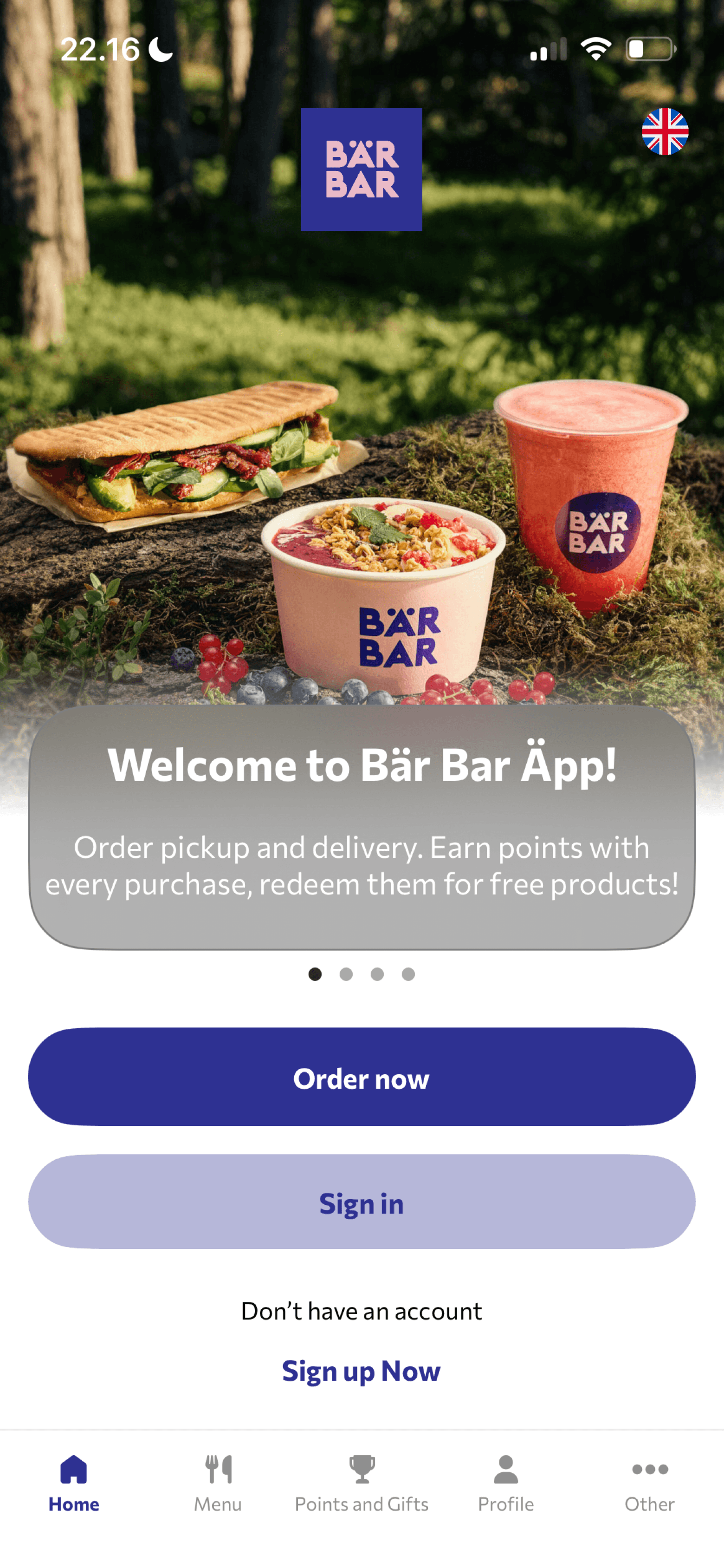
After onboarding, users are welcomed with a brief introduction.
Simplifying how to start an order
It starts with a pop-up card for a quick interaction
Then it is directed into selecting a store to pick up, which is recommended with a nearby location, and a list of other stores.
What’s been improved in the menu browsing is a more consistent layout for product cards and other elements
A new outlook for the 'Home screen'
Integrating a point & reward dashboard into the home screen for more visibility.
Content section displaying new products & daily deals.
Simplifying the nav bar from 5 to 4 buttons.
Before
After

Customizing with better focus
Adding the reward point upfront to make it clear with users.
Decluttering the subtext section with category chips.
Size directly goes with price.
‘Favorite button’ is also moved up front without having to scroll till the end as in the current version.
Before

After

Checking out in 3 steps
The solution is to break the process into 3 subtasks: My cart → Review → Check out.
It simply eases the stress of having to make sure everything correct all at once.
It is indeed a UX technique that aims to improve efficiency and avoid errors, called Progressive Disclosure, where information is exposed gradually over multiple screens.
Implementing a real-time order-tracking
A real-time order tracking for each step after the order is placed.
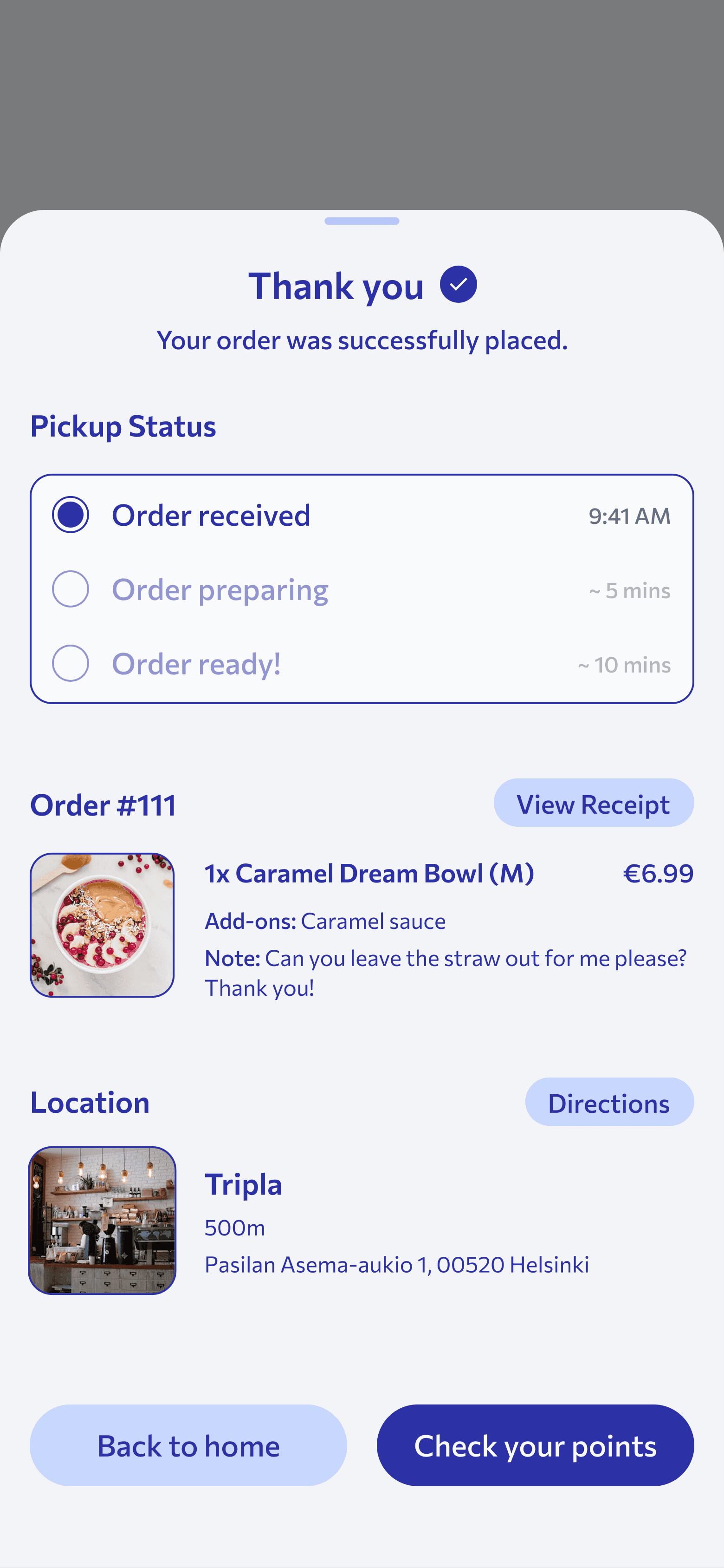
The order-tracking card also shows up in ‘Home’ screen for an easy follow-up.

FINAL DESIGN
A thoughtful change in ‘Onboarding’ with a clear process in ‘Ordering’ has estimably lifted up ~18% in cart-to-order completion.
The ‘After’ design, in fact, does not take way or add in any feature, it is simply a re-organization of visual hierarchy that does not compromise a smooth user experience overall.
REFLECTION
Biggest lesson is how to approach problems objectively
This project marked as my very first opportunity addressing a UX problem from start to finish, so it really pushed me to think critically before making any decision, which happens so often we are filtered with so many ideas.
What kept me grounded is proper research in the early stages to ensure that I am solving the right problems.