
TRAVELOKA
A landing page revamp that focuses on conversion and reduces 20% in bounce rate.
Role
UX Designer
Timeline
2 weeks
Dec 2025
Team
Individual Project
WHAT IS TRAVELOKA?
Traveloka is a leading Southeast Asian travel platform offering flights, hotels, activities, and more. With millions of users across the region, the platform's homepage serves as the primary entry point for trip planning and booking.
It has truly dominated the travel industry in Southeast-Asia with 40M+ of Monthly Active Users and 140M+ app downloads since founded.
So this number speaks volume to how it is an app-oriented platform. However, that is also where the problem has arisen to the website as it is not being built to be focused and optimized.

PROBLEMS
Navigation & Information Overload
The homepage is cluttered with too many entry points, promotions, and product categories competing for attention, especially in the hero section.

the current hero section
Weak Visual Hierarchy
Typography sizes, weights, and spacing are inconsistent across sections. Important CTAs lack sufficient contrast and visual weight.




the current headers and titles across sections
Poor Conversion Optimization
Key conversion elements: search bars, booking CTAs, and promotional offers that are buried under non-essential content, and lack of personalization, leading to high bounce rates and low engagement.





the current searching & booking form with CTAs
CHALLENGE
Instead of a full-scale redesign, my challenge is a revamp of the landing page to reduce visual clutter, increase conversion rates, and create a more intuitive platform for booking users.
REVAMP
A new landing page that makes booking feel at ease.


DETAILS
Hero Section
Declutter the navigation bar by using a hamburger menu to hide less important links.
Implement a white background for the search bar to increase contrast and focus.
Ensure service tabs are visually distinct and easy to identify.
Use ‘Search’ as a primary button instead of an icon to make it more actionable.
Headers & Sub tabs
Use large, distinct headers for each section, with subtext underneath explaining why that content is relevant to the user. Keep the existing tab navigation for consistency.


Cards
Enhanced card visuals with a consistent radius and padding, creating a cleaner, more spacious layout.

Bangkok
🇹🇭
Thailand
1.398.000 VND
per traveller
9.3/10
Exceptional (158.000)
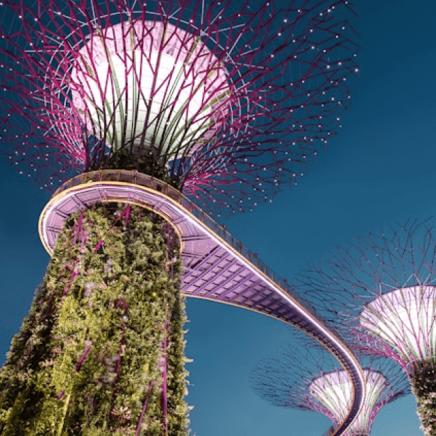
Gardens by the Bay
🇸🇬
Singapore
25% OFF
Year End’s Sale
204.401 /pax
286.161 VND
Include taxes & fees

Hidden beaches in
Phu Quoc
@traveloka
76.6k followers
Hidden beaches in Phu Quoc 🇻🇳
Discover the most serene beaches away from tourist crowds this summer. A perfect 5-day itinerary for beach lovers.
1.2k
20

Hongkong
Hongkong
Buttons
Established a clear and consistent button hierarchy.
Default
Search
Primary
Secondary
Secondary small
Hover
Search
Primary
Secondary
Secondary small
Promotional Banners
Grouped social proof elements into a dedicated section for better impact and clarity.
Optimized white space for background to improve readability.
Why book with Traveloka?
140M+
App Downloads
Trusted by travelers worldwide.
40M+
Monthly Active Users
Travelers active users every month.
1M+
User Reviews
Rated highly on iOS & Android

4.6

4.7
50+
Payment Methods
Flexible & secure payments
& more.
Easy changes
Cancel or change your booking without hassle.
2
4
24/7 Customer support
Reach out to us anytime and anywhere.
Travel made easy
Exclusive extras, discounts and perks.
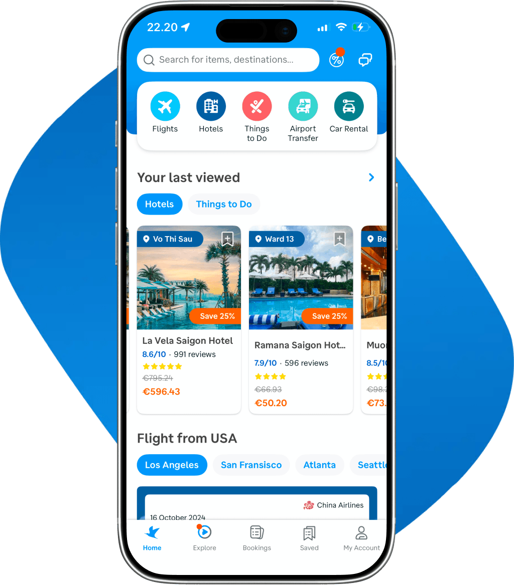
Get the App
Book faster, manage trips on the go.
Download App
Scan the QR code

FINAL DESIGN
Scroll inside the frame for more!
REFLECTION
Small details do matter and can make a huge difference.
Surprisingly, I did not jump in and design the whole system, just like we don’t break down the entire house just because the door is not working.
What I did was a focused retouch of the ‘door’, which in this case is the landing page, and efficiently make it more welcoming for our guests (users), who are likely to be back if the experience is highly delivered.

-
Helsinki
Let’s design better things together!
designed + built with love by Phuong :)
powered by
coffee
8-hour sleep
coffee
cardamom buns
coffee
creative people
coffee
little things
coffee
print design
coffee
morning runs
coffee
quality time
coffee
house music